In Charts: The Yemen War
A collection of charts, maps and graphs explaining the Yemen war.
April 17, 2019
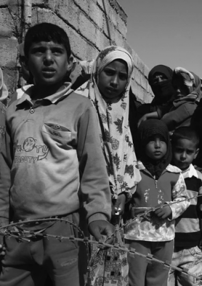
The Yemen war is the world’s worst humanitarian crisis — about 20 million people need humanitarian assistance, the country is on the brink of famine and one million people are suffering from the worst cholera outbreak in modern history.
Below is a collection of graphs, maps and charts exploring the brutal conflict and its horrendous human cost.
To go deeper, check out The Globalist’s Yemen article collection by clicking here
Who is for and against the war in Yemen

What the Saudi coalition is striking in Yemen

The missile war in Yemen

Arms imports by Saudi Arabia

U.S. arms sales to Saudi Arabia

The world’s biggest arms companies

The overall situation in Yemen

Yemen’s humanitarian crisis

Yemen’s Cholera outbreak

Yemen’s health system

The world’s least peaceful countries

If Yemen was 100 people

Takeaways
A collection of charts, maps and graphs explaining the Yemen war.