In Charts: The Yellow Vests
A collection of charts, maps and graphs explaining France, the presidency of Emmanuel Macron and the Yellow Vest protests.
December 8, 2018
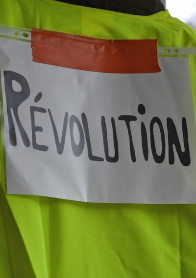
The “Yellow Vest” protest have rocked France and have caught the country — and its politics — off guard. The protest movement has turned into the biggest challenge for French president Emmanuel Macron yet.
Below is a collection of charts, maps and graphs exploring France, the presidency of Emmanuel Macron and the Yellow Vest movement.
To dive deeper into the subject, read our articles on the subject by our expert contributors by clicking here:
The Globalist France article collection
The Globalist Emmanuel Macron article collection
Emmanuel Macron’s approval ratings

Satisfaction with Emmanuel Macron’s performance in his first 100 days in office compared with past presidents

Emmanuel Macron’s approval ratings compared to those of Donald Trump

How Emmanuel Macron won the presidency

How people voted in the presidential election by region

The age at which Emmanuel Macron was elected president compared to other world leaders

The French tax burden camped to that of other developed countries

French expats around the world

How many security personnel France is deploying to deal with the Yellow Vest protests

Main areas of France affected by the Yellow Vest protests

Takeaways
A collection of charts, maps and graphs explaining France, the presidency of Emmanuel Macron and the Yellow Vest protests.